I started working for Placewise Media in May of 2011. Initially my role was fluid, filling gaps where needed. Not being charged with a specific project, however, has it's benefits. With others busy, I was soon tasked with figuring out how to get our content into an app. The project manager for that project was Greg Hickman, founder of the Mobile Mixed podcast.
It took several late nights toward the end of 2011 but we shipped, as promised. As early 2012 arrived, we were tasked with creating not just an app or site, but a larger direction for the entire company. Management could tell that mobile was a transformative force. But it was hard to look past a platform (an app, a site) and determine the larger ramifications on how we approach development. What we needed wasn't a mobile design refresh; we needed a broader content syndication strategy for any screen.
"The anyScreen Project" was the result of our research done in early Q1 of 2012. Some of our recommendations were common sense. Others were purposely more "left field" in order to allow compromise. We presented to a handful of interested groups. We made the document available to decision makers. Then, like so often happens within a company, we started working on other things. Greg moved on and became the Mobile Marketing Manager at Cabela's. I became technical lead on the the Shoptopia App. Ultimately, I also left.
Up till that point none of the recommended courses of action had been seriously considered for assignment and implementation. That doesn't mean they weren't good. Despite some statements now seeming dated I stand by the work. What I regret is not making the strong financial case to justify the effort. With limited resources, illustrating a better consumer experience isn't enough to influence release schedules. We needed a clear path to X% growth in billings. We were arguing hearts and minds when we needed to understand the purse strings.
So, without further ado, here is a public, slightly redacted, copy of the anyScreen report. Enjoy.
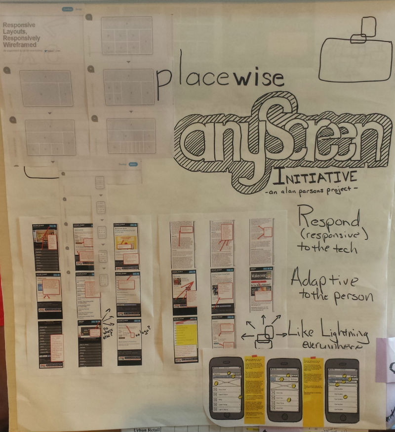
The anyScreen Initiative
Defining a Compelling and Comprehensive Placewise “Multi-Screen” Experience
Our Audience is Changing.
The trend in smart phone usage is clearly one direction:
- 70% of smartphone owners use their mobile phones to influence in-store purchases ( source )
- 92% of retail volume still takes place in brick and mortar stores
- 42% of consumers are more likely to return to stores that have in-store mobile promotions
- 19% of U.S. consumers browse their mobile devices while shopping in-store
- 58% of consumers want to get product information in-store
- 31% of American adults who have cell phones use their phones for the majority of their Internet access ( source )
- Among American adults (18-29) who use the Internet on their phones, 45% do most of their web surfing there. ( source )
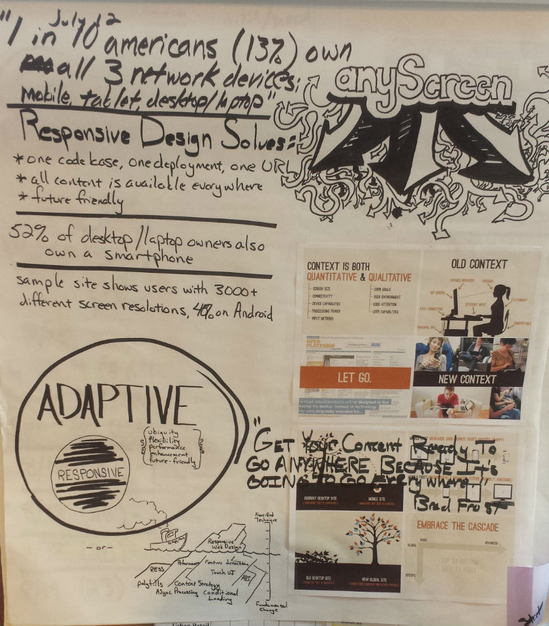
- More than 1 in 10 Americans have a smartphone, desktop/laptop, AND tablet device (13% - July, 2012)
- 52% of American desktop/laptop owners also own a smartphone
- 1 billion smartphones will be sold in 2014
Facebook’s numbers point where most audiences are going: 102 million accessed Facebook solely from mobile in June, 2012. That’s a 23% increase over the 83 million mobile-only users in March. 18.7% of Facebook’s 543 million monthly mobile users don’t visit the desktop site ( source ).
How do we satisfy changing site consumption?
In order to successfully engage audiences in the next year we need to:
- Deliver targeted messages and offers - messages tailored not just to the person's interests but to the platform they're on
- Improve response rates by detecting when a customer is ready to act (through user actions like store follows and deal bookmarking)
- Improve customer loyalty through tailored and personalized experiences
To succeed in these goals we must overcome the existing problems with our current website approaches. After study, five problem areas were identified:
- Fragmented URL Strategy
- Slow Performance
- Little Sensitivity to User Intent
- Poor Mobile Evangelism
- Aging Login & Registration Approaches
Fragmented URL Strategy
Consumers occupy an ecosystem of screens; a Placewise visitor is not a “mobile user” or “laptop user”. The same people interact in a multitude of formats and devices. It is this multi-screen consumption which causes inconsistent and/or problematic behavior with our current inclusion of URLs:
- Do we use a “traditional” website link in an email template which may be read on a mobile device?
- Do we use a mobile url in a push notification or SMS?
- Does a website link posted to social media like twitter or facebook direct to the desktop or mobile experience?
- If a user receives a bit.ly link on a mobile device but content is not mobile enabled what happens?
- What happens if a user attempts to access a mobile-only contest via their desktop browser?
The proposed solution is to no longer have both “m.*” url subdomains and full urls exist simultaneously. There should be one canonical link that references where a location exists online . This link will default to the mobile, responsive experience UNLESS the user is on a device with a screen greater than 1024x768. The purpose during a period of transition is to allow for full, “traditional”, experiences on larger screens while supporting the diversity of lower resolutions.
It will be assumed that mobile links exist for all content; if that content is not available in the responsive template the request will “default” to content that is on the desktop site. This represents 180-degree change from the URL policy that currently exists.
Proceeding in this manner not only provides better search engine optimization (SEO) ( source ). The bigger benefit is from an operations and development standpoint. Among staff there will never be any confusion as to which link to provide. All URLs included in code will be formatted one way. Finally, references to our content can be safely shared across a variety of platforms and services without the danger of the “wrong” link for the viewer’s context causing a sub-optimal experience.
Slow Performance
Speed isn’t only a mobile concern. Numbers from 2011 show that 47% of consumers expect a web page to load in two seconds or less. Further, 74% will abandon if a site takes more than 4 seconds to load ( source ). When given the option of increasing site speed or adding an additional feature, we should always error on the side of speed.
Just making a site responsive doesn’t make it fast. Unfortunately, 86% of responsive sites have the same size or larger page sizes than their desktop counterparts ( source ).
We need to develop with the mindset that if it wasn’t instantaneous it didn’t happen. Speed itself is the killer feature. Speed translates into more time spent on our sites, more return visitors, and more positive overall experiences - all positive outcomes that increase our desirability for brand sponsorship.
Speed increases are possible with:
- Asynchronous Processing – The client facing site or app responds to user interaction immediately while discretely synchronizing with the global server when possible, convenient, or bandwidth permitting. For inspiration on how this can be done review the instagram model of processing images ( source 1 ) ( source 2 ).
- Caching - The fastest response is the one not made. Whether including most-likely pages device side via a multi-page jquery mobile template or saving extra database calls with built in ColdFusion caching, numerous opportunities exist to reduce backend transactional overhead.
- Device Appropriate Images - Responsive images are difficult. However, the benefit is the best pixel-per-bandwidth ratio possible. Because so much of our layouts are graphically heavy savings are possible by a more responsible content serving strategy.
Most people (71%) expect mobile sites to load as fast or faster than desktop sites ( source ). The benefit of all of these approaches, in addition to meeting audience expectation, is they also allow us to scale to a much larger degree on the hardware we already have.
Little Sensitivity to User Intent
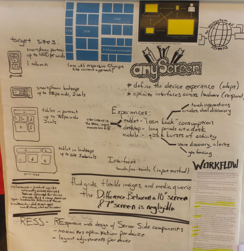
While Responsive Web Design (RWD) has taken a significant portion of designer mindshare since being coined two years ago, it is incomplete. A responsive approach only deals with the technical aspects of a user’s experience. This is primarily thought of as the window size of the content display. Adaptive Design (also referred to as progressive enhancement) is creating an experience for the user’s needs, desires, or situation.
Users expect different experiences on different devices. Tablet and desktop shopping site experiences are both for discovery. In these cases the user is planning a trip: reading articles, bookmarking deals, and making note of events. While the intent is the same, however, the input means are drastically different: keyboard/mouse inputs verses touch interfaces.
Mobile users are action driven in discrete bursts. Google Analytics shows that an overwhelming percentage of Placewise visitors are using mobile to find two things:
- Specific Store Information
- Mall Hours
Our goal should be to encourage repeat visits, not to snare as many clicks per visit as possible. This would better support the mobile user's goal of finding the desired information quickly.
While adaptive design dictates the mobile approach, Responsive Design needs to define our email template creation. Mobile email clients on Android, iPhone, and iPad increased from 4% to 20% from 2009-2011 ( source ). Our recommendation is that email should be formatted to correctly fit their device wherever it is consumed. Resources for building responsive email templates are included in the BaseCamp project.
Poor Mobile Evangelism
Current sponsorship inclusion on mobile sites is a banner below-the-fold. This is unacceptable positioning for such a high percentage of our audience. This occurs because campaigns are created within the context of desktop experiences: Where does this fit in the sidebar? What IAB leaderboard would be appropriate? How can we do a takeover ad similar to Kay Jewelers?
The problem with all of these approaches is that they assume a full sized site with unlimited technical restrictions. For example, the Kay Jewelers ad, while successful, used Flash that was impossible to duplicate for an iPad. Dealing with sponsors who only provide IAB assets can be problematic in a responsive context ( source ).
One opportunity is with rich media advertising providers currently being evaluated. Early tests have been problematic. However, even when one is in place, creating a compelling sponsor experience on mobile needs to be done in conjunction with the desktop.
Another question posed by our current approach is when a user arrives on a mobile website that has a corresponding Android/IOS app, why are we not politely direct a visitor to the corresponding store to download it? Failing to even mention additional touch points with is a glaring failure. How are we expected to promote our sponsors interest when we can’t even promote our own?
Aging Login & Registration Approaches
Typing anything on a mobile device is a pain, but login, in particular, can be difficult. Since mobile devices are user centric why does a user’s session still last only 20 minutes? Expanding the session timeout for devices that are clearly mobile (and therefore personal and unshared) seems an obvious step. But is it possible to go further and emulate the “login once and forget” simplicity of a native app?
Strong consideration needs to be given to the burgeoning “no login” design pattern ( source 1 ) ( source 2 ) ( source 3 ). By eliminating (or reducing) desktop conventions of a username/password pair we would lower the bar to user engagement in non-desktop contexts.
There also is an ongoing debate within Placewise about the correct way to do login. A number of desktop sites employ a shoptopia modal login. The mobile sites use a more federated identity system to provide access on platforms that aren't HTTP based (like the native apps). The discussions have centered around whether to simplify to one system and what that would be. If not a “no login” solution, consideration of an official, published, standard like Oauth 2 should be considered.
Challenges for Implementation
Moving to responsive email templates and site design will require changes to existing workflows. In a recent survey 56% of design teams reported workflow as a significant challenge when faced with responsive design ( source ). Features should be wireframed and mocked mobile first as it forces refinement of the idea to its essential components. The feature can then be progressively enhanced for more capable browsers or available technologies.
The idea of wireframing and interactive prototypes can be a shock to traditional creative design. For many studios design practices have been standardized around static, fixed Photoshop mockups. Those processes prove inadequate when having to deal with the realities of a living, breathing web ( source 1 ) ( source 2 ) ( source 3 ).
But even more of a procedural challenge is the mental one. This plan requires a change in thinking. Different native platforms have distinct conventions. You can’t simply port over one design to all native mobile platforms. Interactions and expectations differ. We need to be flexible enough to conceive solutions in terms of puzzle pieces that adapt to different devices instead of fixed canvas designs.
As John Allsopp correctly pointed out in 2000, the flexibility of the web is a feature, not a bug ( source ). Treating creation of digital sites in the same way as a printed product is a mistake. However, while new design workflows are necessary to support any screen, they haven’t yet been clearly identified.
The Way Forward, Now
The desktop site, as it currently exist, is a sacred cow. It is our client's approved vision. It is a weighty mass of everything that our clients believe a website to be; this includes glamour shots, press releases, and property management “about us” pages. Any overnight change to embrace fully visitor-centric adaptive design may be interpreted as butchering the mall’s branding. There will be push back.
Our opportunity for learning what works is on mobile. Despite approaching half of their overall traffic the mobile presence is a supplemental afterthought to many. Clients do not realize the speed at which mobile is becoming the primary means by which people engage their content. It is essential that we figure out how to create engaging, adaptive experiences on this platform while still having the freedom to experiment. Finding that flexibility is an asset and future proofs our designs for consumption on new devices (the web on our fridge! In our car dashboard!). Once the centers are aware that mobile is their primary touch point they will be more more loath to allow us to make the necessary mistakes to refining our approach.